
Visualization Tools Chicago
Visualization Tools Chicago

Key Highlights
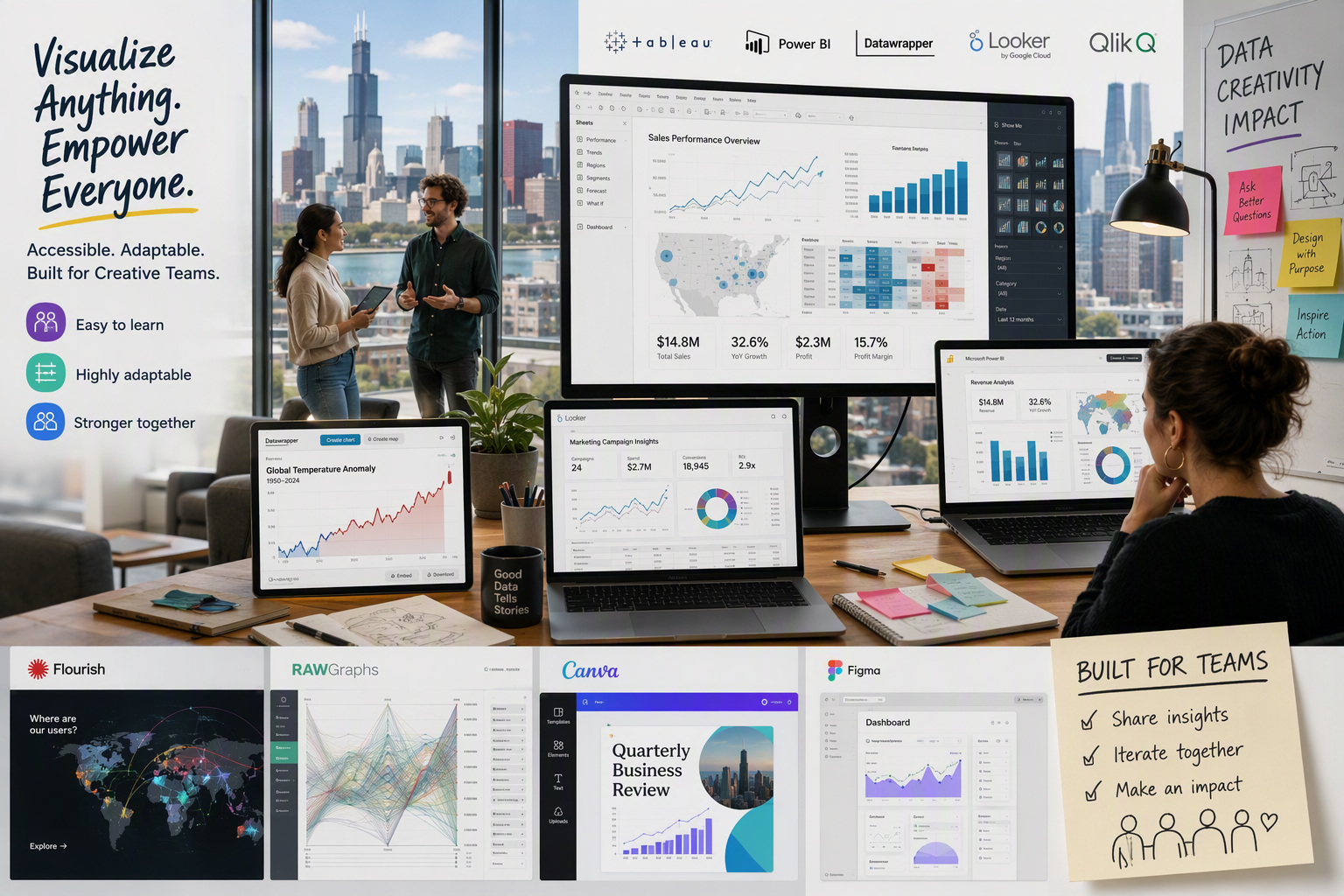
- Chicago teams use data visualization to turn raw data into clear charts, dashboards, and faster decisions. Popular business intelligence choices include Power BI, Tableau, Looker Studio, Qlik Sense, and Zoho Analytics. Among these, Tableau is known for its intuitive drag-and-drop interface and rich visualization options, Flourish is valued for its story-driven templates and ease of embedding interactive graphics online, and Power BI stands out for its strong integration with Microsoft products and robust analytical capabilities. Comparing these tools, Tableau excels in flexibility and advanced chart options, Flourish specializes in storytelling and effortless web publishing, while Power BI offers powerful analytics and seamless connectivity for organizations familiar with Microsoft platforms. Teams often select the tool based on the balance of user experience, customization, and compatibility with their data sources.
- Popular business intelligence choices include Power BI, Tableau, Looker Studio, Qlik Sense, and Zoho Analytics.
- The best fit depends on your data source, budget, data volume, and your team’s technical skill.
- Non-technical users often prefer tools with drag-and-drop setup, spreadsheet connections, and ready-made templates.
- Open-source options can support data analysis when flexibility, control, and lower cost matter.
- Modern tools stand out through real-time updates, interactive dashboards, governance, and natural language features.
Introduction
Data visualization helps you turn raw numbers into charts, dashboards, and visual stories that are easier to understand. For Chicago businesses, that matters because faster data analysis often leads to better daily decisions. Today’s business intelligence platforms do much more than display graphs. Many BI tools support live data, sharing, governance, and even natural language questions. Still, no single platform works for every team. The right choice depends on your workflows, users, and the complexity of your data.
Top Visualization Tools in Chicago for 2024
If you ask which data visualization tools are most popular among professionals, a few names show up again and again. Power BI, Tableau, and Looker Studio are common starting points because they cover different needs across business intelligence teams.
In Chicago, the best data visualization tool often depends on how your team works. Some platforms are built for advanced analysis, while others focus on speed, sharing, and ease of use. The tools below show where each option fits best.
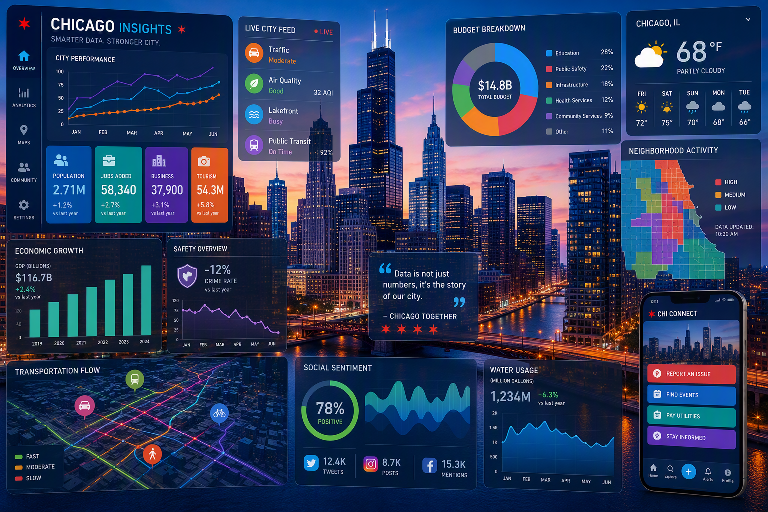
1. Tableau
Tableau remains one of the most recognized names in data visualization and business intelligence. It is widely used by analysts who want interactive dashboards, strong data storytelling, and deep data analytics capabilities. For teams handling varied datasets, Tableau offers a polished way to explore patterns and present findings clearly.
What stands out is its ability to support advanced exploration and large-scale reporting. Compared with Power BI, Tableau is often seen as strong for visual analysis and storytelling, while Power BI is tightly connected to the Microsoft ecosystem. The compiled information does not cover Flourish in detail, so a full feature-by-feature comparison is limited here.
That said, Tableau also comes with a steep learning curve. Basic visuals are possible early on, but advanced calculations, complex data blending, and broader database work usually require stronger technical knowledge, often including SQL familiarity.
2. Microsoft Power BI
Microsoft Power BI is one of the most common choices for business intelligence and data analysis. It helps you build a data dashboard beyond what basic spreadsheets can offer, using a drag-and-drop layout, built-in charts, and AI-supported insights. For many teams, it is a natural starting point.
A major advantage is its connection to the Microsoft ecosystem. Microsoft Power BI works well with Excel and other Microsoft products, which makes adoption easier for business users already working in those systems. It also offers freemium access, so smaller teams can test its features before moving to paid plans.
Still, Power BI is not always simple. To unlock advanced data analysis, data modeling, and broader sharing, you often need more technical skill and familiarity with DAX. Compared with Tableau, it is often more budget-friendly, but still has a notable learning curve.
3. Looker Studio
Looker Studio is a practical data visualization platform for teams already working with Google data. It is especially approachable for users who rely on Google Analytics or Google Sheets and want a lighter path into reporting. For Chicago businesses, that makes it a useful option for quick dashboards and routine data analysis.
Its appeal comes from ease of access and a lower barrier to entry. Compared with Tableau and Power BI, Looker Studio is generally more beginner-friendly, though it is less focused on advanced data models and enterprise-scale control. That makes it better suited to lighter reporting than complex business intelligence operations.
If your team needs a simple way to turn familiar Google data into visual reports, Looker Studio is a strong option. If you need deeper modeling, heavier governance, or broader enterprise workflows, Power BI or Tableau may fit better.
4. Qlik Sense
Qlik Sense is a strong choice for organizations that need business intelligence with deeper data exploration. Among BI platforms, it is known for its associative engine, which helps users uncover hidden relationships across datasets. That makes it useful when you want to explore data from different angles instead of following a fixed report path.
The platform also supports interactive dashboards, self-service analytics, and advanced data integration. For teams asking which tools work best for business intelligence purposes, Qlik Sense belongs in the discussion because it can handle more complex reporting needs and larger environments.
At the same time, it is not the easiest tool for casual users. Even though it is more approachable than older Qlik products, it still takes time to learn. It can also become expensive, especially for enterprise use or larger user groups.
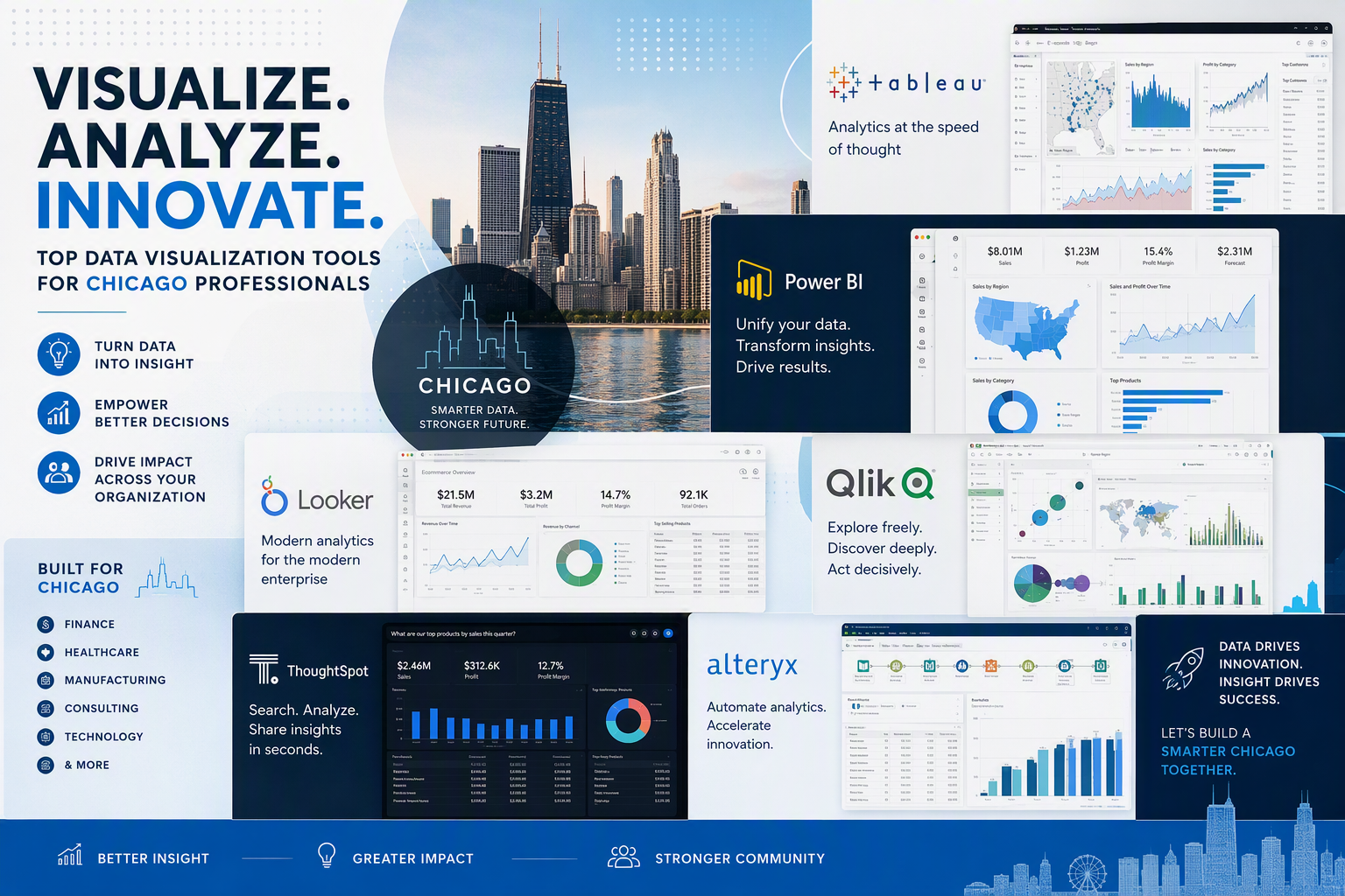
5. Sisense
Sisense is often considered when teams want BI tools that bring data visualization, business intelligence, and data integration together in one place. For organizations juggling multiple systems, that combination can help simplify reporting and support more consistent data analytics across departments.
From a business point of view, tools in this category work best when they reduce friction between data sources and dashboards. That matters if your team wants faster access to insights without depending on constant manual updates. In Chicago, companies with growing reporting needs often prioritize that kind of connected setup.
The compiled information does not provide detailed product-specific features for Sisense, so it is best to place it in the broader business intelligence group rather than make claims beyond the source material. In general, tools like this are evaluated on integration depth, scalability, sharing, and ease of maintaining trusted reporting.
6. Domo
Domo is listed as a large business intelligence option for medium to enterprise businesses. That makes it relevant for teams that need an analytics platform capable of pulling together many dashboards, users, and reports across a broad operation. If your primary need is enterprise reporting, Domo enters the conversation.
In practice, tools like Domo are judged by how well they connect each data source, how easily teams share dashboards, and how smoothly reports support decision-making. This can be valuable for organizations working across departments such as sales, operations, and marketing platforms.
The source material gives only a brief mention of Domo, so a detailed feature breakdown is not available here. Still, it fits the category of business intelligence tools designed for larger environments rather than lightweight charting. For smaller teams, simpler platforms may be easier to manage and afford.
7. Zoho Analytics
Zoho Analytics is a modern data visualization tool that works especially well for teams already using other Zoho products. It combines charts, pivot tables, data integrations, and AI-supported features in a platform that aims to make reporting more accessible. For many business users, that balance is appealing.
For a non-technical team, Zoho Analytics can be a practical option when spreadsheets need to become interactive dashboards. Its drag-and-drop approach, reporting automation, and data preparation features lower the barrier for users who want results without heavy coding or complex setup.
There is still some learning involved. The platform is generally easier to approach than more technical tools, but advanced work can require extra time, and some onboarding details may feel thin. Even so, its ease of use and built-in automation make it a solid choice for growing teams.
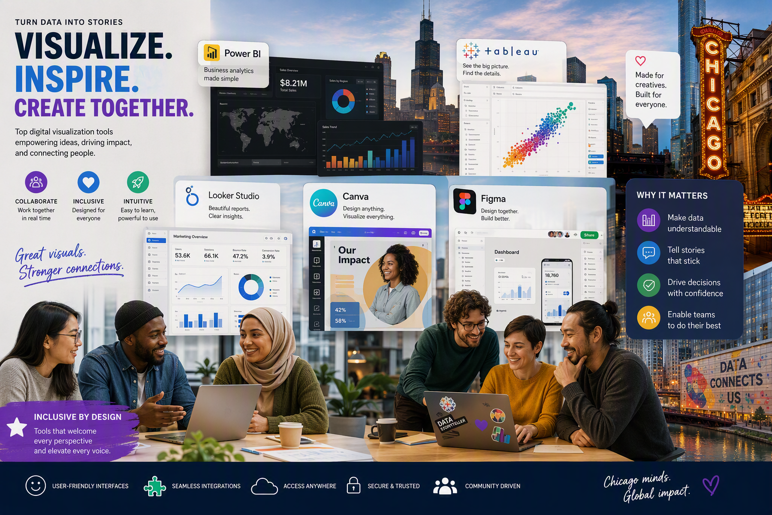
8. Google Data Studio
Google Data Studio, now known as Looker Studio, is one of the easiest free tools for beginners to consider. If you already use Google Analytics or Google Sheets, it offers a simple way to connect each data source and start building reports without much setup. That familiarity matters when you are just getting started.
Its strength is accessibility. You can create clear data visualization outputs with a lower learning curve than many enterprise tools. For beginners, that makes it a practical first step before moving into more advanced platforms with deeper modeling or governance features.
The tradeoff is that it is better for lighter reporting than complex business intelligence. If your needs are straightforward and your data lives in Google products, Google Data Studio remains a strong option. If your requirements expand, you may later need a platform with more advanced controls.
9. Klipfolio
Klipfolio is built for teams that care deeply about tracking KPIs and centralizing reporting. Instead of acting like a broad business intelligence suite, it focuses heavily on data dashboards and metric definitions. That makes it useful when your organization wants to monitor performance closely and keep key numbers visible.
One reason Klipfolio stands out is its support for live reporting. If you are asking which tools support real-time data updates, this platform belongs on the list. It also connects with many data sources and offers pre-made dashboards, which can speed up setup for recurring reporting needs.
The challenge is usability. Klipfolio is less intuitive than simple drag-and-drop tools, and the setup around metrics and data connections can feel technical. For teams comfortable with structured KPI management, it can work well. For casual users, the learning process may feel slower.
10. Databox
Databox is described in the source material as user-friendly and focused on automated reporting. That makes it appealing for teams that want straightforward data visualization around key metrics without building a highly customized analytics environment from scratch. It is especially useful when speed and simplicity matter.
Professionals often favor tools that make recurring reporting easier, and Databox fits that pattern. If your team needs business intelligence at a practical level, with dashboards built around performance tracking, it can support regular data analysis without demanding heavy technical overhead.
The compiled information does not go deeper into product-specific features, so it is best to keep expectations grounded. Databox should be seen as a focused reporting option rather than a fully detailed enterprise platform in this article. For many teams, though, ease of use is exactly the point.
11. IBM Cognos Analytics
IBM Cognos Analytics is commonly associated with business intelligence environments that manage complex data and formal reporting structures. For organizations working with a data warehouse and strict reporting requirements, tools in this class are often valued for control, consistency, and broader enterprise support.
When businesses ask what visualization tools work best for business intelligence purposes, they are usually looking beyond chart design. They want governance, repeatable definitions, secure sharing, and the ability to work with larger systems. IBM Cognos Analytics fits that kind of conversation more than lightweight dashboard tools.
The provided material does not supply detailed product features, so this overview stays general. Based on the business intelligence context in the source, a platform like this is most relevant when your reporting environment is structured, your data is complex, and long-term reliability matters more than quick setup.
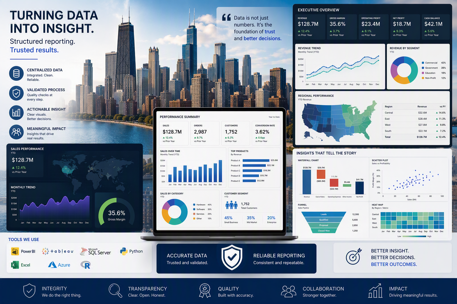
12. Yellowfin BI
Yellowfin BI combines dashboards, automated insights, and data storytelling in one business intelligence platform. That makes it useful for teams that want more than static charts. Instead of only presenting numbers, it helps users explain trends through interactive reports and guided visuals that support better communication.
A key benefit is balance. Business users can explore data without always depending on IT, while analysts can go deeper with AI-driven insight support. Mobile access, self-service reporting, and natural language query features also add flexibility, especially for organizations that need broader adoption across departments.
If you are wondering what features to look for in a data visualization tool, Yellowfin BI highlights several: storytelling support, action-oriented dashboards, automated analysis, secure sharing, and self-service exploration. Those features matter when your goal is not just seeing data, but helping teams understand it quickly.
13. Chartio
Chartio is often remembered as a simpler option among BI tools for teams that wanted approachable reporting and easier access to data analytics. In conversations about easy-to-learn platforms, tools in this group are usually judged on interface clarity, setup speed, and how quickly users can connect a data source.
For students or first-time users, ease of use matters more than advanced enterprise depth. A platform like Chartio is relevant because it represents the kind of reporting tool that aims to reduce friction and make analysis feel less technical. That can be valuable during early learning.
The compiled information does not include detailed current features for Chartio, so this section stays broad. If your goal is to learn reporting basics, beginner-friendly platforms with clean workflows are often a better starting point than tools built for highly complex governance or heavy technical customization.
14. Geckoboard
Geckoboard fits the part of the market focused on clear dashboards and live data visibility. For teams that want to monitor performance throughout the day, that kind of setup can support practical business intelligence without the weight of a full-scale analytics stack. Simplicity is often the main attraction.
When people ask which data visualization tools support real-time data updates, dashboard-first products like Geckoboard are part of the answer. Their value comes from fast visibility, simple displays, and data connections that keep performance numbers current for teams that need ongoing operational awareness.
The source material does not provide detailed Geckoboard features, so this overview stays careful. Based on its category, it is best thought of as a live dashboard tool rather than a broad data exploration platform. That makes it useful when speed and visibility matter most.
15. Mixpanel
Mixpanel is closely tied to data analysis for product teams that need to track behavior across many data points. In that setting, the value of a visualization tool is not only chart quality. It is also about how clearly the platform handles metric definitions and helps teams monitor user activity over time.
For teams choosing a tool, this highlights an important point: the best platform depends on the decisions you need to support. Product-focused reporting often needs event tracking, trend monitoring, and quick interpretation of behavior patterns rather than broad enterprise reporting across every department.
The compiled information does not list detailed Mixpanel features, so it is safest to keep the description general. Still, it represents a useful reminder that different tools serve different workflows. A platform that fits product teams well may not be the right tool for executive business intelligence.
Most Popular Features in Visualization Tools
When you compare any data visualization tool, a few features keep showing up as decision makers. Teams usually want ease of use first, but they also need advanced features that support larger workflows and stronger trust in reports.
Interactive dashboards, flexible data models, filtering, and live connections matter because they reduce friction between questions and answers. If you are choosing a platform, focus on the features that match how your team actually works. The sections below break down the most useful ones.
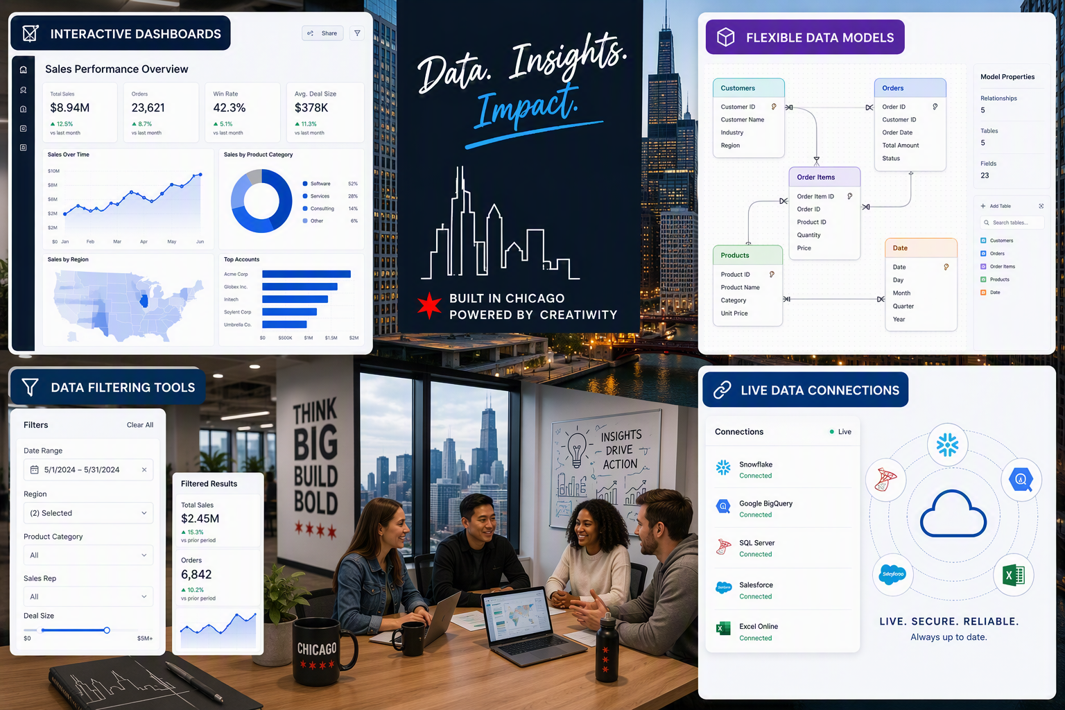
Interactive dashboards
Interactive dashboards are one of the most requested features in business intelligence because they let users explore information instead of just reading a fixed report. For non-technical users, this matters a lot. A good dashboard turns data visualization into something practical, clickable, and easier to understand.
Tools such as Power BI, Looker Studio, Zoho Analytics, and Yellowfin BI are often good fits for teams that want interactive dashboards without deep coding. They help users filter views, monitor real-time data, and support data storytelling for meetings, status checks, and decision-making.
Useful dashboard traits include:
- Simple filters and clickable charts
- Fast updates tied to live or refreshed data
- Clean layouts for business users
- Easy sharing across teams
If your team wants quick wins, choose a platform where dashboard building feels guided rather than technical. That usually improves adoption and lowers training time.
Real-time data updates
Real-time data updates matter when your team cannot wait for yesterday’s numbers. In business intelligence, this is especially important for operations, KPI monitoring, and fast-moving reporting. Live dashboards reduce lag and help teams act on what is happening now, not what happened hours ago.
The source material points to platforms like Klipfolio for live reporting, and it also highlights platform-native analytics as a strong option when you need data updates directly on governed data. In that model, dashboards query live information instead of relying on extracts or manual refreshes.
If your work depends on current performance, ask how the tool handles updates behind the scenes. Some products support real-time data smoothly, while others depend on scheduled refreshes, uploads, or extracts. That difference has a direct effect on trust, speed, and the accuracy of daily decisions.
Customizable data visualizations
Customizable data visualizations help you shape reports around your audience, not just your dataset. That matters when leadership wants one view, analysts need another, and client-facing teams need something simpler. A strong data visualization tool should let you adjust visuals without rebuilding everything from scratch.
The best platforms balance flexibility with control. Too few options can limit communication. Too many can raise the learning curve. This is where stronger data models and advanced features become useful, especially if your organization works with different reporting needs across departments.
Look for customization such as:
- Flexible chart types and layout choices
- Control over filters, labels, and formatting
- Reusable components tied to governed data models
When a platform supports these basics well, your team can create reports that stay clear, consistent, and useful. Customization should help communication, not turn report building into a technical project.
Advanced data filtering and analytics
Advanced data filtering gives users a faster path from raw data to useful insight. Instead of scanning a static report, you can narrow by time period, region, team, or product and quickly see what changed. That makes data analytics more actionable, especially when the questions keep shifting.
This matters even more with large datasets. Some tools struggle when data volume grows, while others are designed to query live information at scale. If your organization deals with millions of rows or frequent updates, filtering and performance should be core selection criteria, not afterthoughts.
Useful filtering and analytics capabilities include:
- Multi-level filters for faster drill-down
- Strong performance on large datasets
- Support for deeper calculations and comparisons
In short, advanced features should reduce manual effort. The goal is to help users explore confidently without forcing them into complex technical steps every time they need an answer.
Open-Source Visualization Tools to Consider
Yes, open-source options are worth considering if you want more control, lower cost, or a setup that your team can adapt over time. They can support data visualization and data analysis without locking you into a single commercial path.
That said, open-source BI tools often work best when your team has some technical comfort. They can be powerful, but they may require more setup and maintenance than packaged business platforms. Here are four options that often enter the conversation.
Apache Superset
Apache Superset is often mentioned when teams want open-source BI platforms with strong charting and dashboard capabilities. It is built for data analytics and data exploration, making it appealing to organizations that want flexibility without immediately committing to a commercial platform.
Its value comes from breadth. In open-source discussions, Superset is usually seen as a tool that can support dashboards, visual reporting, and wider analytical workflows for teams that are comfortable managing their own environment. That can be a smart fit when customization matters more than out-of-the-box simplicity.
The source material does not provide deep product details for Superset, so this overview stays high level. In general, it is best suited to teams that want control and can support setup internally. For non-technical users, a simpler hosted tool may feel easier from day one.
Metabase
Metabase is frequently considered by teams that want open-source reporting with better ease of use than more technical alternatives. It is often chosen for straightforward data analysis, especially when users want to connect a data source and start answering questions without building a highly customized analytics stack.
Among open-source tools, that lighter feel matters. Many organizations want the cost and control benefits of open-source software, but they do not want every reporting task to depend on developers. Metabase is relevant in that space because it is often associated with a gentler user experience.
The compiled information does not list detailed Metabase features, so it would be wrong to overstate specifics. Still, if you are asking whether open-source tools are worth considering, Metabase belongs on the shortlist when accessibility and quick reporting are part of the goal.
Grafana
Grafana is widely associated with dashboards and real-time data monitoring. In open-source discussions, it often comes up when teams need visibility into constantly changing information and want a dashboard layer that can support operational awareness. That makes it especially relevant for live reporting scenarios.
The appeal is straightforward. Grafana combines open-source flexibility with a dashboard-first approach, which can be useful when data integration and fast updates matter more than polished business storytelling. If your team needs to watch current activity closely, this type of tool can fit well.
The source material does not provide detailed Grafana-specific capabilities, so this section stays general. Based on the broader context, Grafana is worth considering when real-time dashboards are a priority and your team is comfortable with a more technical environment than typical beginner-focused BI tools.
D3.js
D3.js is an open-source option that stands apart from dashboard-first BI platforms. It is best known for highly flexible data visualization work, especially when standard chart libraries are not enough. If your project involves complex data or unusual visuals, D3.js can be a powerful tool.
Its strength is creative control. Teams that care about custom design and data storytelling often consider D3.js because it allows visual outputs that are far more tailored than many packaged tools. That said, flexibility usually comes with more technical effort and a greater build requirement.
The provided source does not give feature-level detail for D3.js, so this overview stays broad. As a rule, it is worth considering when your need is custom visual communication rather than ready-made business intelligence workflows. For general users, a dashboard platform is usually easier to adopt.
Best Visualization Tools for Non-Technical Teams
For non-technical teams, the easiest tools are usually the ones that remove setup friction. Power BI, Looker Studio, Google Data Studio, and Zoho Analytics stand out because they support spreadsheets, offer a drag-and-drop interface, and keep the learning process manageable.
The right data visualization platform should help business users move from rows of numbers to dashboards quickly. Features like spreadsheet connections, templates, and guided editing matter more here than deep technical customization. The next sections show what makes these tools easier to adopt.
Drag-and-drop interfaces
Drag-and-drop interfaces are one of the biggest reasons non-technical teams can build reports without waiting on specialists. When business users can place charts, filters, and tables visually, the learning curve drops and adoption usually improves. That makes reporting feel accessible rather than technical.
Power BI, Looker Studio, and Zoho Analytics all benefit from this approach. They help teams turn spreadsheet data into dashboards through guided visual steps instead of code-heavy workflows. For many departments, that is the fastest path from question to answer.
Helpful interface traits include:
- Visual chart building without coding
- Easy placement of filters and dashboard elements
- Clear workflows for first-time users
If your team is new to reporting, prioritize ease of use over advanced complexity. A smoother interface often creates better long-term habits because people are more willing to explore and maintain their own dashboards.
Spreadsheet integration
Spreadsheet integration matters because many teams still start with files before they move into broader reporting systems. If your data source is Google Sheets or similar spreadsheet exports, the right platform should connect easily and reduce manual formatting work. That makes data analysis much faster.
Looker Studio and Google Data Studio are especially beginner-friendly when your reporting already lives in Google Sheets. Power BI also works well for users coming from Excel. These connections help non-technical teams move into dashboards without rebuilding everything from scratch.
Look for spreadsheet-friendly features such as:
- Direct imports from Google Sheets
- Simple refresh options for updated files
- Smooth data integration into visual reports
If a team mostly works in spreadsheets today, start there. The best first tool is often the one that respects current habits while giving users a clearer and more interactive way to view the same information.
Pre-built dashboard templates
Pre-built dashboard templates can save small teams a lot of time. Instead of starting from a blank page, users pick a layout, connect their numbers, and adjust only what matters. That makes many BI tools feel less intimidating for people who are new to data visualization.
Templates are especially useful when your team needs weekly reports, KPI summaries, or simple operational dashboards. They create structure, speed up setup, and reduce the chance of poor layout choices. For small teams, that kind of support often matters more than advanced customization.
Useful template benefits include:
- Faster report creation
- Cleaner design for first-time users
- Easier repeat reporting across teams
If your goal is quick adoption, templates help. They give non-technical users a practical starting point and turn dashboard creation into a guided task rather than a fully open-ended design challenge.
Visualization Tools for Business Intelligence in Chicago
For business intelligence in Chicago, the best tools are usually the ones that combine strong data connections, trustworthy governance, and usable dashboards. Power BI, Tableau, Qlik Sense, Yellowfin BI, and platform-native analytics are common fits for teams with wider reporting demands.
A good data visualization platform for BI should support more than charts. It should help with sharing, security, collaboration, and reliable data analytics across departments. The next three sections cover the features Chicago organizations should weigh most carefully.
Integration with business data sources
Strong data integration is a core requirement for business intelligence. A dashboard is only useful if it connects to the right data source and keeps definitions consistent. For Chicago organizations, that often means pulling data from spreadsheets, departmental systems, cloud platforms, and a central data warehouse.
The source material emphasizes that some tools connect directly to cloud warehouses and live governed data, while others rely on extracts or uploads. That difference affects speed, trust, and maintenance. If your stack includes environments such as Amazon Web Services, direct connectivity becomes even more important.
Check for integration needs such as:
- Direct links to your main data source
- Compatibility with your data warehouse
- Support for cloud systems like Amazon Web Services
The best BI tools reduce duplication and manual syncing. When analytics run close to the data, reports are often fresher, more accurate, and easier for teams to trust.
Security and governance features
Security and governance matter more as more people use data analytics across the business. It is not enough to create attractive dashboards. You also need clear permissions, trusted definitions, and ways to keep reporting logic consistent. That is a major reason business intelligence platforms differ from simple chart tools.
The compiled information highlights governed self-service, centralized logic, and secure sharing as key modern expectations. It also points to collaboration needs such as version control and permissioned workspaces. These features help organizations scale reporting without losing trust in the numbers.
Important governance capabilities include:
- Role-based access and sharing controls
- Centralized definitions for metrics
- Version control for team collaboration
If your dashboards influence real business decisions, governance is not optional. It protects accuracy, reduces rework, and helps different teams use the same language when they review performance.
Collaboration options for teams
Collaboration is a practical requirement for any business intelligence setup. A data visualization tool should help teams build, review, and share reports without constant confusion over access or ownership. When data sharing is smooth, decisions happen faster and fewer people work from outdated files.
The source material stresses governed workspaces, secure sharing, and shared environments. These features help teams collaborate confidently, especially when multiple departments rely on the same dashboards. In larger organizations, that structure becomes as important as the charts themselves.
Useful collaboration options include:
- Shared workspaces for teams
- Secure links and permissioned access
- Commenting or review-friendly report sharing
When choosing a BI platform, ask how easily your teams can work together. A tool that supports collaboration well often creates better adoption because reporting becomes part of everyday work rather than a siloed analyst task.
How to Choose the Right Visualization Tool for Your Project
Choosing the right tool starts with matching the platform to your project, not chasing the flashiest charts. Think about where your data lives, who will use the reports, how much data analysis is needed, and whether your goal is lightweight data visualization or full business intelligence. You should also weigh budget, sharing needs, and the learning curve for your team.
A simple way to decide is to map needs to tool type:
| Project need | Best starting point |
|---|---|
| Spreadsheet-based reporting | Looker Studio or Power BI |
| Advanced visual analysis | Tableau |
| KPI dashboards and live monitoring | Klipfolio |
| Enterprise BI with deeper exploration | Qlik Sense |
| Governed analytics on live platform data | Platform-native BI |
From there, test the tool against actual workflows, not just demo dashboards.
Assessing project goals and data complexity
Start by defining your project goals. Are you building executive dashboards, tracking daily operations, or exploring trends in detail? Different BI tools serve different purposes, so the best choice depends on the decisions your reports need to support, not on popularity alone.
Next, look at data complexity and data volume. Some tools work well for spreadsheets and departmental reporting, while others are better for large datasets, governed environments, or live querying. If your information is spread across systems, integration needs become part of the decision too.
Ask yourself:
- How complex is the data analysis required?
- How large is the data volume?
- Will users need fixed dashboards or open exploration?
Clear answers here help you avoid overbuying or choosing a tool that feels easy at first but struggles once your reporting needs grow beyond simple charting.
Budget considerations and cost of ownership
Budget is not only about license price. The full cost of ownership includes setup time, training, maintenance, and the effort needed to keep dashboards accurate. Many teams start with free or lower-cost BI tools, then move up once reporting needs become more demanding.
That is often a smart starting point. The source material notes that pricing models vary widely, from per-user plans to larger capacity-based costs. A cheaper tool may still become expensive if it requires lots of manual work or specialist support to keep it running well.
When reviewing cost, consider:
- License pricing as your team grows
- Training and support time
- Ongoing maintenance and refresh effort
The best budget choice is the one that fits current needs without creating hidden complexity later. Cheap is not always efficient, and expensive is not always necessary.
Evaluating learning curve and support resources
A tool can look impressive in a demo and still fail if your team cannot use it confidently. That is why the learning curve matters. Some BI tools are built for analysts with stronger technical skill, while others focus on ease of use for business users who need fast results.
The source material makes this clear. Power BI and Looker Studio can be beginner-friendly in the right setting, while Tableau and Qlik Sense often ask more from users over time. Support resources also matter because tutorials, communities, and documentation affect how quickly your team becomes productive.
Review these points:
- How much technical skill does the team have?
- Are training materials and support resources strong?
- Will everyday users feel comfortable after onboarding?
If adoption is your goal, pick the tool your team can realistically learn and maintain, not the one that only looks powerful on paper.
Conclusion
In conclusion, choosing the right visualization tool is crucial for effectively interpreting data and making informed decisions. With numerous options available in Chicago, from user-friendly tools like Tableau and Microsoft Power BI to open-source alternatives such as Apache Superset, there is a solution for every team and project. By assessing your specific needs, budget, and the complexity of your data, you can select a tool that not only meets your requirements but also enhances collaboration and insight generation. Don’t hesitate to explore these tools further—your team’s success in data visualization awaits! If you're interested, get a free consultation to find the perfect tool for your project.
Frequently Asked Questions
What are the best free visualization tools for beginners in Chicago?
For beginners, free tools with ease of use matter most. Google Data Studio, now Looker Studio, is a strong data visualization option because it works well with Google products and has a lower learning curve. Power BI’s free version can also be a helpful starting point for simple reporting.
Which tools are best for creating interactive dashboards for non-technical users?
For non-technical teams, the best tools for interactive dashboards are usually Power BI, Zoho Analytics, and Google Data Studio. They offer ease of use, drag-and-drop setup, and accessible workflows for business users. These platforms make it easier to turn spreadsheet data into dashboards without heavy technical work.
How do features of Tableau, Power BI, and Flourish compare for Chicago businesses?
For Chicago businesses, Tableau is strong in visual analysis and data storytelling, while Power BI stands out for business intelligence inside the Microsoft ecosystem and a lower entry cost. The provided source does not detail Flourish features, so a full three-way comparison cannot be made here from the compiled information alone.
You might also like