
Visualization Tools Madison
Visualization Tools Madison

Key Highlights
- Data visualization helps you turn raw numbers into clear stories you can act on faster.
- The best visualization tools depend on your goals, data sources, budget, and team skills.
- Some platforms focus on business intelligence and custom dashboards for ongoing reporting.
- Others are better for quick interactive charts, web embeds, or simple visual storytelling.
- Free and low-cost options give beginners and small teams a practical starting point.
- Modern tools increasingly support live data, self-service use, and easier analysis for more people.
Introduction
Data visualization makes complex information easier to understand. Instead of scanning rows of data, you can use charts, dashboards, and visual summaries to spot patterns quickly. Today, data visualization tools do more than create attractive reports. They support business intelligence, faster decisions, and better communication across teams. If you are comparing options in Madison, it helps to know which tools match your data, your workflow, and your comfort level. The sections below walk you through strong choices and what each one does best.
Top Visualization Tools Madison Users Should Know About
If you want a quick list of leading visualization tools, start with Tableau, Microsoft Power BI, Looker Studio, Qlik Sense, Flourish, RAWGraphs, Datawrapper, Canva, Infogram, and Plotly. These tools cover a wide range of business users, from beginners building simple reports to technical users handling deeper data analysis.
Some are built for dashboards and business intelligence. Others are better for embeddable visuals, custom chart types, or research work. The key is finding a fit for your data sources, your need for live data, and how much customization you want. Let’s look at each option one by one.
1. Tableau – Advanced Analytics for Business
Tableau is one of the best-known names in business intelligence because it gives you strong design control and highly interactive visualizations. It is often used for reporting, exploration, and storytelling with data. If your work involves serious data analytics, Tableau stands out for variety and depth.
For beginners looking at free tools, Tableau Public is a realistic starting point. It is easy enough for users with different skill levels and supports connections to sources like Google Sheets, Microsoft Excel, SAS datasets, and SPSS. That makes it useful when you want to learn without buying Tableau Desktop right away.
There is one important tradeoff. Tableau Public saves both dashboards and underlying data publicly. If your information is sensitive, it is not the right fit unless you can use public or aggregated data. For private business use, paid Tableau options are the safer path.

2. Microsoft Power BI – Integrative Data Insights
Microsoft Power BI is a strong choice if you want rich business intelligence and highly interactive reporting. It combines data visualization with dashboards, tables, and reporting tools that work well for everyday business use. Many teams choose it because it feels familiar, especially if they already work in the Microsoft ecosystem.
A big advantage of Power BI is how it handles multiple data sources. You can build custom dashboards and combine information from different systems in one place. The Power Query interface also helps with data models, which is useful for Excel power users who want a smoother move into analytics.
For marketing analysts, microsoft power bi is often recommended because it supports dashboard monitoring and cross-source reporting. The free version is feature-rich, but sharing can be harder, and file-based limits may matter if you work with very large datasets.
3. Google Looker Studio – Free and Accessible Dashboards
Google Looker Studio, previously called google data studio, is one of the easiest free tools to start with. If you already have a google account, you can connect to several sources and build simple dashboards without much setup. For small teams and individual users, that low barrier matters.
It works especially well with google analytics, Google Sheets, and other Google products. You can create reports that update from live data, which is helpful when you want current performance views without manual exports. Templates from Google and other users can also speed up the process.
If you are asking about free alternatives to RAWGraphs, Looker Studio is one option, though it serves a different use case. RAWGraphs is stronger for unusual chart designs, while Looker Studio is better for accessible dashboards and everyday reporting.

4. Qlik Sense – Interactive Data Exploration
Qlik Sense is built for people who want deeper data exploration without giving up a polished business intelligence experience. It helps you move through information interactively, which can make it easier to see relationships across metrics, categories, and performance trends.
This type of platform is useful when your team works with many questions, not just fixed dashboards. You can look through data tables, connect findings across views, and shape analysis around your workflow. That flexibility makes it appealing when standard reports feel too narrow.
Another reason users consider Qlik Sense is its customization options. When you need more control over how visuals behave or how a dashboard is organized, that extra freedom helps. If your data models are growing more complex, Qlik Sense can feel like a practical step up from basic reporting tools.
5. Flourish – Engaging Visual Storytelling
Flourish is designed for visual storytelling. It is especially known for animated and presentation-ready outputs that help business users share information in a more engaging way. If you have seen moving bar charts over time, you have likely seen the kind of effect Flourish handles well.
Compared with other visualization tools, Flourish leans more into storytelling than enterprise dashboarding. It is less about heavy business intelligence and more about clean, eye-catching interactive charts that work well in articles, presentations, and public-facing content.
Key points to know:
- The free version lets you create unlimited visuals with templates.
- It is strong for animated and interactive charts.
- Live .csv files or Google Sheets connections require paid access.
- It is a good fit when presentation quality matters more than deep analysis.
6. RAWGraphs – Open-Source Customization
RAWGraphs is an open-source visualization platform built for people who want more experimental or less common chart styles. It works as a bridge between spreadsheets and design-focused visuals, making it useful when default dashboard charts do not tell the full story.
One of its biggest strengths is flexibility. You can paste raw data or connect through sources like Microsoft Excel and Google Spreadsheets, then shape visual outputs with strong customization options. It is especially effective for showing relationships and flow-based structures that many standard tools do not emphasize.
If you need free data visualization tools similar to RAWGraphs, Datawrapper, Google Looker Studio, and Google Charts are worth exploring. Still, each has a different focus. RAWGraphs remains a strong option when open-source control and unusual visual forms matter most.

7. Datawrapper – Quick Online Visualization
Datawrapper is a practical data visualization platform for people who need clean online visuals fast. It is not a full dashboard tool, but it is very effective for charts, maps, and tables that are ready to publish. If your goal is speed and clarity, it does the job well.
You can add data by uploading csv files, excel files, or by copying and pasting directly. That simplicity lowers the barrier for new users. It also supports a range of chart types, so you are not boxed into only basic formats when presenting trends or comparisons.
Another plus is how well Datawrapper fits web pages. The free tools are robust, and the output is polished enough for presentations or embeds. Free visuals include attribution, and export limits exist, but for quick publishing with straightforward embed code, it is a strong option.
8. Canva – Infographics for Non-Designers
Canva is not a full-scale analytics platform, but it is very useful for non-designers who want infographics and simple visual content. If your focus is communication rather than detailed data analysis, Canva can help you turn information into clear, attractive graphics.
Its biggest advantage is ease of use. You choose a template, add your numbers, and build a visual that works for reports, presentations, or social media. The chart features are basic, yet that simplicity is exactly why many beginners like it. You do not need much training to get started.
Canva also becomes more useful when you want to combine data visualization with branding and layout design. The free version is generous, with many creation options and downloads. It is best when your priority is message delivery, not advanced dashboard logic.
9. Infogram – Marketing-Focused Visuals
Infogram is a strong choice for marketing analysts who need visual content that feels polished and easy to share. It supports infographics, reports, maps, and business dashboards, which makes it useful for teams that need both campaign visuals and internal reporting.
The platform includes more than thirty-seven interactive charts and supports real-time updates, so your data visualization can stay current as numbers change. That is valuable when you monitor campaign performance, traffic trends, or engagement metrics. It also keeps version history, which helps when you update materials often.
If you are asking which visualization tools are recommended for marketing analysts, Infogram belongs on the list with Power BI and Databox. Its free plan covers the basics well, though private sharing and downloadable work are more limited without paid access.
10. Chart.js – Developer-Friendly Charts
Chart.js is best known as a developer-focused choice for building clean visuals on the web. If you are comfortable working in a code environment, it can be a useful path for creating custom charts that fit directly into your site or product.
A key benefit is control. Instead of relying on preset dashboards, a developer can adjust chart options to match exact layout and styling needs. That makes it appealing when your project requires brand consistency, tailored behavior, or chart interactions that standard tools may not handle well.
It is also a smart fit for responsive charting. When visuals need to work smoothly across screens, lightweight chart libraries stand out. For teams that want interactive charts inside digital products rather than a separate reporting tool, Chart.js is a practical option.

11. Plotly – Scientific & Complex Graphing
Plotly is a standout tool for data science teams and technical users who work with complex data. It supports interactive reports and connects well with Python, R, SQL databases, and csv files, which makes it useful when your analysis already lives in code.
This flexibility matters for machine learning and scientific graphing. Plotly can handle statistical charts, financial charts, maps, and multi-chart views for comparing datasets. If your work goes beyond simple business dashboards, that range gives you room to build more detailed visual outputs.
Another strength is how it supports exploration close to the analysis itself. Instead of exporting results into another tool, you can visualize findings where you work. For researchers, analysts, and developers handling sophisticated use cases, Plotly is one of the more capable options available.
12. ChartBlocks – Simple Chart Creation
ChartBlocks fits people who want straightforward chart creation without a steep setup process. It is part of the broader group of free tools that focus on speed and simplicity rather than heavy business intelligence features. If you need a quick visual, that can be enough.
Its value comes from ease of use. You choose chart types, add information, and produce a finished chart without spending much time learning a large system. That makes it useful for beginners, students, or small teams that need simple reporting support.
You can think of it in the same practical space as chartbuilder-style tools. It is not meant to replace advanced data visualization software, but it can cover everyday chart needs well. When your goal is fast chart output rather than full analytics management, simple tools often win.
13. Sisense – Embedded Analytics
Sisense is often considered when organizations want embedded analytics rather than a standalone reporting layer. That means bringing charts, dashboards, and insight directly into products or workflows your business users already use every day.
This kind of visualization platform is helpful when you do not want people switching between multiple systems. Instead, analytics can sit inside the tools where decisions happen. For companies serving customers or internal teams through software, that approach can save time and improve adoption.
Sisense also appeals to teams looking for advanced features tied to business intelligence. It is less about quick one-off charts and more about scalable, integrated analytics experiences. If embedded use is central to your strategy, this category of tool deserves attention during your evaluation.
14. Zoho Analytics – Self-Service BI
Zoho Analytics is commonly viewed as a self-service bi tool for teams that want reporting without heavy technical overhead. It is especially relevant for small teams that need to work independently and answer everyday questions from their own data.
Self-service matters because not every business has dedicated analysts for each request. A tool in this category helps users connect data sources, create reports, and review metrics with less reliance on technical support. That can make decision-making quicker across departments.
For growing organizations, Zoho Analytics fits the broader move toward accessible business intelligence. If your team values ease, flexibility, and practical reporting over complex engineering setups, a self-service option like this can be appealing. It works best when your users need usable insights more than highly customized enterprise architecture.
15. Domo – Cloud-Based Visualizations
Domo is a cloud-based option that many teams explore when they want dashboards available from anywhere. Its model is useful for organizations that depend on distributed access, fast updates, and one place to view performance across departments.
A major strength is support for live data and broad data connections. When metrics are moving quickly, dashboards that refresh from current sources are much more useful than static reports. That matters for operational monitoring, executive views, and teams that need a current picture of results.
Domo is often discussed in the context of business dashboards rather than entry-level charting. It is designed more as a visualization platform for ongoing management and visibility. If your use case centers on cloud reporting and current metrics, it is worth considering.

16. Grafana – Real-Time Data Dashboards
Grafana is a strong option when real-time data matters most. It is widely associated with dashboards that monitor changing information, which makes it useful for teams that need to watch performance, systems, or continuously updated metrics as they happen.
That focus changes the value of the tool. Instead of only building static monthly reports, you get a setup that supports fast-moving views, interactive charts, and constantly updated panels. For technical environments or operations-heavy teams, that style of reporting can be much more useful.
It also helps that dashboards can combine visuals with data tables and different data connections. When you need both trend lines and supporting details in one place, that mix improves clarity. Grafana fits best where timing, monitoring, and live visibility are central needs.
17. Highcharts – Flexible Chart Options
Highcharts is well known for giving teams flexible chart options inside web applications and reporting experiences. If your project needs more than standard bars and lines, a platform like this can help you shape visuals around exact presentation needs.
Its appeal comes from breadth and control. You can work with many chart types and adjust behavior, appearance, and interactions to fit your use case. For teams that care about how charts behave inside a product or a reporting portal, those customization options matter.
While it is not always the first name in business intelligence discussions, Highcharts supports the visual layer many organizations need. It works well when a data visualization platform must be tailored closely to brand, interface, or user experience expectations.
18. TimelineJS – Visualize Chronological Data
TimelineJS is a focused option for chronological data. Instead of trying to cover every chart style, it helps you build interactive visualizations that tell stories across time. That makes it especially useful for education, content projects, and timeline-based reporting.
One reason beginners like it is the setup. The free version lets you create timelines using google sheets, and the platform provides guidance so even nontechnical users can get started. If your data already lives in a simple spreadsheet, that process feels approachable.
It is not one of the broadest data visualization tools, but it does one job very well. When dates, milestones, events, or historical sequences are the center of your story, TimelineJS can be a better fit than a general dashboard product.
19. Google Charts – Easy Web Embeds
Google Charts is a free option aimed at web-based visual output. It extends what you can do beyond standard Google Sheets charting and gives you more control over chart types and presentation. For developers, that makes it a useful lightweight choice.
It works especially well when you need charts on web pages. With code-based setup and embed code support, you can integrate visuals directly into internal tools or public sites. If you are comfortable with a technical approach, that flexibility can be a big plus.
For users asking which online tools let them visualize large datasets for free, Google Charts can be part of the answer for web projects. Still, it is better suited to technical users who can manage the learning curve and setup requirements.
20. Weave – Research Data Visualization
Weave, short for Web-based Analysis and Visualization Environment, is an open-source option often connected with research data and flexible analysis needs. It is web-based, interactive, and designed to work with a range of sources, maps, charts, and tables.
For research projects, tools like Weave are useful because they support public data, multiple views, and customizable outputs. If you are building a list of visualization tools for research projects, Weave belongs alongside Plotly, RAWGraphs, TimelineJS, and Palladio depending on the kind of work you do.
Once set up, it is considered easy to use and flexible. It can combine a data source with maps, data tables, and charts in ways that support exploration. That makes it appealing when research requires more than a static graph.
21. Metabase – Free BI Tool for Teams
Metabase is often grouped with accessible analytics products because it works as a free bi tool for teams that want practical reporting without too much complexity. It fits organizations that need answers from data but may not want a heavy enterprise rollout.
The strongest value here is usability for shared work. A team can connect data sources, create queries or dashboards, and use the platform for ongoing data analytics. That balance makes it appealing for departments that need repeatable insight but not endless configuration.
Team collaboration is also part of the appeal in this category. When more people can review and discuss findings in one place, analytics become more useful across the business. For smaller organizations, a free tool with collaborative business intelligence features can go a long way.

22. Redash – Query and Visualize from Many Sources
Redash is built for teams that want to query and visualize data from many sources in one environment. If your reporting depends on pulling information from different systems, that flexibility can save time and reduce reporting friction.
Its approach is especially helpful for users who want both querying and charts in a connected workflow. Instead of separating the technical step from the visual step, you can move from a query builder to data visualization more directly. That makes the tool appealing to mixed technical and analyst teams.
Redash also supports collaboration. When people can share queries, review results, and collaborate around interactive charts, reporting becomes easier to maintain. For businesses managing several data sources, Redash offers a practical way to centralize exploration and presentation.
23. Apache Superset – Modern Data Exploration
Apache Superset is often discussed as a modern choice for data exploration. It suits organizations that want a flexible analytics environment and users who need more than basic dashboard templates to answer business questions.
That makes it appealing for a business analyst working with changing requirements, varied metrics, or layered reporting needs. Tools in this category often support richer workflows around data models and more advanced features, which helps when reporting is not simple or static.
It also fits environments where analytics overlap with technical work such as machine learning or larger-scale data systems. While it may not be the easiest starting point for everyone, Superset can be a strong choice when your team wants modern exploration power and can handle a more capable setup.
24. GoodData – Scalable Analytics Platform
GoodData is a strong fit for organizations that want scalable analytics with a solid modeling layer. It combines drag-and-drop simplicity for beginners with enough depth to support more serious reporting work, which gives it a useful middle ground.
A big reason teams consider it is the way it supports data models alongside business intelligence. When reports depend on consistent logic and reusable definitions, that structure becomes important. It helps users move past one-off charts and build something more dependable.
GoodData also belongs in discussions around embedded analytics and broader platform needs. The free version has limits on workspaces and storage, but it still offers a chance to explore the product. If your team wants a data visualization platform that can grow with reporting demands, it is worth attention.
25. Palladio – Humanities-Focused Visualization
Palladio is designed with humanities and historical analysis in mind. It is a good example of how visualization tools can serve specialized fields instead of trying to solve every business dashboard problem. If your work centers on relationships, geography, or historical context, it offers a different kind of value.
You can bring in research data from spreadsheets, drag-and-drop files, or linked public files, then create map views, graph views, lists, and gallery views. That makes it useful for exploring structured material in ways that support interpretation rather than only KPI reporting.
Among free data visualization tools, Palladio stands out for academic and humanities use cases. It is not built for heavy interactive dashboards, but its clean output and focused design make it helpful when data tables need to support cultural or historical storytelling.
26. Candela – Specialized Visualization Components
Candela is a specialized visualization library meant for data science work. It is open-source and built for repeatable visuals at scale, which makes it more relevant to technical teams than to casual business users.
If you know JavaScript, Python, or R, Candela gives you a path to build from a data source with more control than a basic dashboard tool usually offers. It includes templates for standard chart types and geospatial views, making it useful when visual output needs to support real-world analytical applications.
This is not the easiest choice for beginners. Still, for teams that need specialized visualization and advanced features, it can be a strong fit. Candela works best when your project lives inside a technical workflow and requires custom, reusable components rather than one-off reporting.
27. Chartbuilder – Rapid Chart Generation
Chartbuilder is a simple answer when your main goal is quick visualization. It helps you select chart types, enter data, adjust series settings, and export results without spending time inside a larger reporting platform. That speed is its real advantage.
Because the workflow is straightforward, chartbuilder is useful for one-off visuals, drafts, or fast presentation support. You are not dealing with a large feature set, which can actually be a benefit when the need is basic. Many users prefer that kind of focused experience.
It also fits well with csv files and other simple inputs. Among free tools, it is a practical option for people who want to build a chart and move on. If your project does not require dashboards or advanced modeling, smaller tools like this are often enough.
28. Dygraphs – Large Dataset Line Charts
Dygraphs is an open-source library built for line charts and time-based analysis. It is especially useful when you need to display large datasets clearly without giving up interactivity. That makes it relevant for technical and monitoring-focused projects.
Its strength shows up with time series work. If you are tracking performance over time or working with signals that change often, Dygraphs gives you interactive charts that support dense information more smoothly than many general tools. That focus makes it different from broad dashboard platforms.
Because it is lightweight and customizable, it also suits real-time data contexts. You can use it where speed and scale matter more than presentation extras. For teams dealing with large datasets and continuous trends, Dygraphs is a focused and capable choice.

29. Leaflet – Interactive Maps
Leaflet is a popular open-source choice for interactive maps. If your project depends on geographic data, it gives you a lightweight way to build visuals that support zooming, panning, layer switching, and other map interactions.
Its appeal comes from simplicity and extension. Leaflet has core features that cover many mapping needs, and it also supports many plug-ins when you want more options. That flexibility makes it useful as a map-focused visualization platform rather than a standard chart dashboard.
For teams needing geographic presentation, Leaflet can feel more practical than forcing maps into a general reporting tool. It is especially useful when you want flexible chart options centered on location data. If your story lives on a map, Leaflet is worth serious consideration.
30. OpenHeatMap – Geographic Data Mapping
OpenHeatMap is a free option for people who want simple data mapping without deep technical work. It allows spreadsheet-based information from CSV, Excel, or Google Docs to be imported and displayed on maps, making geographic visuals easier to produce.
That is useful when your data source already exists in a basic file format. Instead of building a mapping workflow from scratch, you can take structured information and turn it into interactive visualizations or static maps more quickly. For many users, that simplicity is the main benefit.
Among data visualization tools, OpenHeatMap is not the most advanced, but it fills an important gap. It supports nontechnical users who need location-based reporting and want a more accessible entry point into geographic data work.
31. Visme – Dynamic Presentation Tools
Visme sits between design software and analytics communication. It is useful for dynamic presentations, reports, and infographics that turn spreadsheet content into visuals people can understand quickly. If your priority is polished presentation, it offers a helpful balance.
Business users often choose tools like this when they need visual analytics for meetings, proposals, or client-facing materials rather than deep dashboard management. That makes Visme more of a communication product than a full reporting platform, but that can be exactly what some teams need.
Its free package is limited in storage and project count, yet it still gives you a way to create structured visual content. For users who want data visualization that fits neatly into slides and branded materials, Visme is a practical option.
32. Visualize Free – Drag-and-Drop Analysis
Visualize Free speaks to a common need: simple data analysis through a drag-and-drop experience. Tools in this space appeal to users who want to explore information visually without writing code or spending weeks learning a platform.
That ease can make a real difference for beginners and smaller teams. Free tools with a drag-and-drop setup lower the barrier to entry and help more people participate in business intelligence work. When more users can ask questions of the data, insights spread faster.
If you are searching for a starting point, a product positioned like visualize free can be useful for learning and quick reporting. It may not offer every enterprise capability, but it supports the practical goal of making analytics more accessible to everyday users.
33. Databox – Mobile-First Dashboards
Databox is a cloud-based reporting option that works well for small teams needing accessible dashboards. One of its strongest features is mobility. If you want mobile dashboards that let you check performance on the go, Databox is built with that use case in mind.
It supports over seventy integrations and can also accept manual input or Google Sheets data. That range of connections helps teams combine live data from common business platforms like Facebook Ads, Shopify, Adobe Analytics, and more. For small operations, that convenience matters.
The free plan includes a useful set of features, including a few custom dashboards, several users, and many pre-built metrics. If you need business intelligence without a large setup, Databox offers a friendly starting point with practical day-to-day value.
34. Polymaps – Advanced Map Visualizations
Polymaps belongs in the map-focused side of data visualization software. It is aimed at projects where geographic data needs more than a basic location marker and where map visualizations are central to the story being told.
Open-source mapping tools appeal to teams that want control and flexibility. In those cases, a specialized mapping approach can work better than forcing geographic data into a general dashboard builder. That is especially true when the visualization needs custom behavior or layered geographic detail.
If your organization values advanced charting for map-based reporting, tools like Polymaps deserve a look. It is not the right fit for every business use case, but it can be valuable when location intelligence is a core part of your analysis and communication.
35. FusionCharts – Business Dashboards
FusionCharts is often associated with polished business dashboards and a wide range of interactive charts. It works well for teams that need visual outputs suited to enterprise use, where presentation quality and variety both matter.
One clear benefit is breadth. When you need many chart types for different reporting situations, a tool like FusionCharts offers flexibility without forcing every metric into the same visual format. That can improve clarity across operational, financial, and executive reports.
For organizations evaluating data visualization software, FusionCharts fits best where dashboards are part of a product, portal, or internal reporting system. It is not just about making one chart look good. It is about supporting a broader dashboard experience with professional, interactive output.
36. Chartist.js – Responsive Charting Library
Chartist.js is a free tool aimed at the developer who needs simple, lightweight charting on the web. It is a useful option when your goal is not a full dashboard system but a clean charting library that can fit into existing interfaces.
Its biggest strength is responsive charting. If you expect charts to work well across desktop and mobile layouts, using a lightweight library can be more effective than embedding a heavy reporting product. That helps when user experience matters as much as the chart itself.
It also supports different chart types and interactive charts in a flexible way. For developers building web pages or internal tools, Chartist.js offers a practical route to custom visuals. It is best for teams comfortable with implementation and looking for a focused, free option.
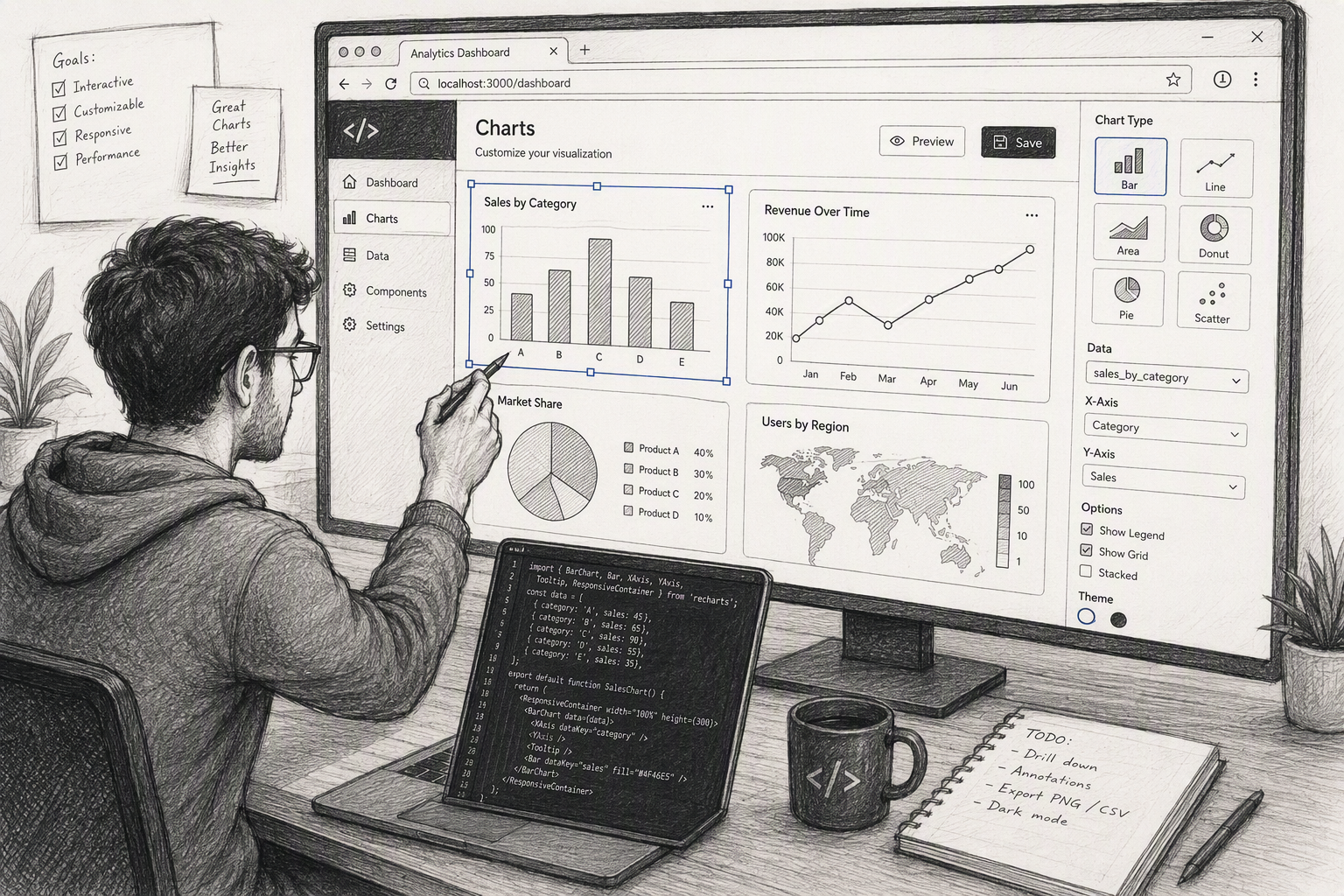
Key Features to Consider in Visualization Tools
When comparing platforms, do not focus only on looks. The most important key features usually include data connections, chart types, sharing options, and how well the tool fits your team’s workflow. A flashy dashboard means little if your data is hard to access or trust.
You should also think about ease of use, technical skill levels, budget, and scale. Some teams need quick drag-and-drop reporting. Others need live queries, governance, or room for large datasets. The next sections break down these decision points so you can choose with more confidence.
Data integration capabilities
Data integration should be one of your first checks. Some platforms connect directly to live systems, while others rely on extracts, CSV uploads, or manual refreshes. The more your reporting depends on current information, the more important strong data connections become.
This matters because weak integrations slow everything down. If your team uses many data sources, you want a tool that can combine them without constant workaround steps. For example, some beginner-friendly options work smoothly with google sheets and other familiar systems, which is helpful for smaller teams.
In larger business intelligence environments, integration affects accuracy, speed, and trust. Tools that operate directly where data lives reduce lag and duplication. Whether you are handling spreadsheets or enterprise platforms, your tool should support the way your data actually flows.
User interface and ease of use
The best tool for your team is not always the most advanced one. Often, it is the one people will actually use. A clear user interface and strong ease of use can make a bigger impact than a long list of features most users will never touch.
For new users, the learning curve matters a lot. A drag-and-drop system can help teams build reports quickly and feel confident early on. That is one reason tools like Power BI and Looker Studio are often recommended as a starting point for beginners.
On the other hand, technical users may accept a steeper learning curve if it gives them deeper control. The key is matching the interface to the people doing the work. If your team needs fast adoption, do not underestimate simplicity.
Customization and chart options
Customization can make the difference between a chart that is merely correct and one that is actually useful. If you are a business analyst presenting to leaders, the ability to adjust chart types, labels, styles, and interactions can improve understanding fast.
Some tools are made for quick output. Others give you more freedom over interactive charts, branding, and visual behavior. A simple chartbuilder tool may be enough for one-off needs, while a larger platform may suit recurring reports with more detailed presentation rules.
Here is a simple comparison:
| Need | Best Fit |
|---|---|
| Fast basic chart creation | Chartbuilder-style tools with limited setup |
| Branded dashboard visuals | Platforms with stronger customization options |
| Web-based interactions | Tools built for interactive charts and embeds |
| Analyst reporting variety | Products offering many chart types and layout control |
Collaboration and sharing functionality
A visualization tool becomes more valuable when it supports collaboration. If only one person can build or access reports, insight stays trapped. Teams usually need a way to review results, comment, distribute dashboards, or publish visuals securely.
Sharing needs vary. Some organizations want formal business intelligence workspaces with permissions and governance. Others just need a chart posted to a site or report. That is why features like embed code, web publishing, and shared access options are worth checking before you commit.
Think about how your team actually works. Do people need to edit together, send dashboards across departments, or publish visuals for outside audiences? The right sharing model can remove friction and make analytics useful across far more people.
Cost and free alternatives
Cost shapes almost every software decision. Many teams begin with free tools or a free version before moving into paid business intelligence platforms. That is a smart approach when you are learning, testing a use case, or working with limited budgets.
For beginners, some of the best free visualization tools available include Tableau Public, Looker Studio, Datawrapper, and RAWGraphs. Each supports a different kind of work, so the best choice depends on whether you need dashboards, public storytelling, or custom chart designs.
Good beginner-friendly free options include:
- Tableau Public for learning strong visual design with public data
- Looker Studio for dashboarding with Google products
- Datawrapper for quick online charts and tables
- RAWGraphs for unusual visuals and open-source flexibility
Conclusion
In conclusion, selecting the right visualization tool can significantly enhance your data analysis and storytelling capabilities. Whether you’re leveraging advanced analytics with Tableau or creating eye-catching infographics with Canva, each tool offers unique features tailored to different needs. By understanding your specific requirements—like data integration, ease of use, and customization options—you can make an informed choice that aligns perfectly with your objectives. Remember, the right visualization tool not only simplifies the data interpretation process but also empowers you to communicate insights effectively. If you're ready to explore these tools further, don’t hesitate to get a free trial and see which one fits your needs best.
Frequently Asked Questions
Which visualization tools are best for beginners in Madison?
For beginners in Madison, tableau public and google data studio are two of the easiest starting points. Both are free tools that lower the barrier to data visualization and help you create interactive charts without a complex setup. They work well for learning, basic reporting, and early portfolio projects.
How do I choose the right visualization tool for business needs?
Start with your use case. Then compare data sources, team skills, budget, and the key features you need for data analysis. If you need dashboards, governance, and sharing, focus on business intelligence tools. If you need quick visuals or web embeds, a lighter option may be better.
You might also like